This is line art of spiderman fighting the Lizard. For this, I colored under the line art. Spider man has his original red and blue suit. With the webs near the armpits, I was originally going to color the webs under his suit light blue to match the original comics back then. The brick wall is a brick color, with the ledge being a concrete gray, the well being colored, the water, the webs up above, the pipe and the upper area. The Lizard's skin color took me awhile to find , but I finally found it and his eyes are an orange color. he tools that I used were the wacom tablet, pencil tool, wacom drawing pen, and the swatch colors available.
This is me as an avatar native from the movie Avatar. I used many different layers to create this. The background is an Avatar painting of the landscape. I dragged and added ears too. I also applied a hue saturation of an Avatar blue on my face and purple on my nose and lips. If you notice, my hair is not colored, because I just want my face to be blue. Finally, I added white paint on my face to make it look like face/warpaint.

This is the mixed media project by me. I used many different files to create this project, it had to go through 19 steps to create in total and use many different blending options. First, I had to get a blanc canvas and upload a paint file onto it. Next, I uploaded a spiral jpg in the background. Next, I made the background a cyan color. Then I had to upload a guitar jpg and have it fade away and get rid of the flooring. Then I made the guitar reappear in the picture. Then I added in a sheet music jpg and I cut it jagged. Then Iadded in some eigth notes and a light yellow lightning bolt on the sheet music. hen I added in the word music by creating a new layer and covering it white and erasing the white and positioning the word below the guitar. Next I added in a fire place jpg and made it blend in the picture to look like flames. Next, I added in an envelope jpg and faded it to create some light on the picture. Finally, I applied levels and brightened the picture and counter balanced it with shadows.
This is my typogrophy project I created in contemperary design this week in class. As you can see, this image is entirely made up of text. These words include paw, cat, tail, ear, cream, pointy, and more. This is the most text layers that I have ever used in an image. I used a text box for each individual word and had to place and rotate each word making up the picture, I used the text tool for all of this, edit, and text size. Finally, I added a white background layer and used a screen blend tool to have the words make up the entire image.
I did these in class today, because I was bored and was finished with the work for this week. These are both images off the internet. The top one is called the jump for the moon. It is a picture of the Packers playing the Seahawks in week 31. Before, this was a picture, but now it is a painting. The bottom one is called Flight of the Skyraider. It was also a picture too. But now it is a painting. I used a white layer for both of them and size 11 art history brush.
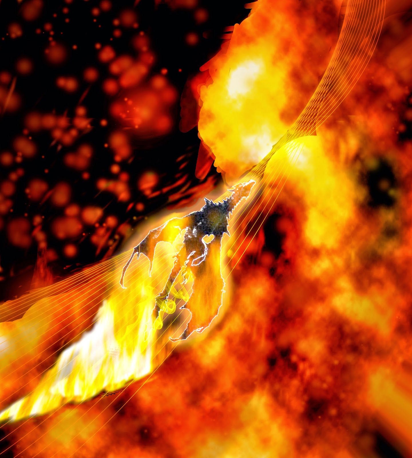
This piece is called the burning dragon. This is a fire poster that we worked on in class this week. There is also another poster that I will work on next, which is an ice poster which is the opposite of fire. I had to go through many steps to create this. First it was black and white flames painted with an orange color and turned into a sphere. I next added colored lines in and then I painted out the left side with black. Next, I added in a picture of a Skyrim dragon as a centerpiece. I put an orange glow around it and used a smoke brush. I next added in fire in the back and on the wings. I then put in stars in the background and used levels to make contrast of the image. Finally, I used a red color filler layer for the background with another color, using opacity brushes and blend modes and finally, I darkened the image with a 20% opacity on the corners and edges to draw your attention to the picture and the dragon, which is the focal point.
Today, in contemporary design. I created this by using the pen tool on this program called Adobe Fireworks. I made the line design and then copied it by using command over again until I got this. I had to make curves and lines to make this, enjoy what you see.